Palatino was never intended for books, yet it became a global publishing standard.
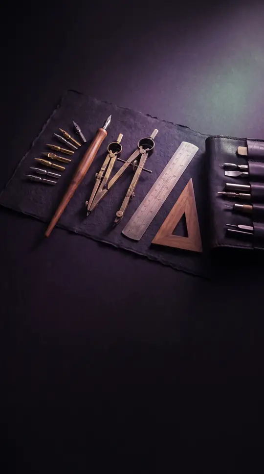
In short: Designed by Hermann Zapf in 1949, Palatino was built as a robust commercial typeface for advertisements and headings, not body text. Its wide structure and open counters were engineered to remain legible on poor-quality paper. Today, it stands as one of the most widely used serif typefaces in history.
Hermann Zapf created Palatino to solve a specific technical problem: the poor-quality paper common in post-war Germany. By thickening the strokes and increasing the proportions compared to traditional Renaissance-style typefaces, Zapf ensured the letters remained clear even when printed at small sizes or viewed from a distance. Despite his insistence that it was a 'jobbing' face for trade use, its legibility made it an accidental favorite for book body text, eventually overshadowing Zapf's own design, Aldus, which had been specifically crafted for that purpose.
The typeface is deeply rooted in the humanist traditions of the Italian Renaissance, drawing inspiration from the broad nib pen techniques of 16th-century calligrapher Giambattista Palatino. Zapf, an expert calligrapher himself, incorporated unique details like the 'palm Y'—a style reminiscent of the Greek letter upsilon. While these calligraphic flourishes were initially prominent, many were later refined or replaced with more sober alternates as the typeface evolved through various technologies, from hot metal typesetting to modern digital formats.
Palatino's ubiquity in the digital age was cemented when Linotype licensed it to Adobe and Apple for PostScript technology, making it a preinstalled standard on most computers. This popularity led to a proliferation of clones, such as Monotype's 'Book Antiqua,' which Microsoft bundled with its software. The ease of copying typefaces in the US, where abstract designs lack copyright protection, fueled this trend and even led to Zapf resigning from the Association Typographique Internationale in 1993 in protest of the industry's tolerance for unauthorized imitations.
The family has continued to expand, with Zapf collaborating on new versions well into his eighties. In 2005, he premiered 'Palatino Nova,' a comprehensive redesign, and later introduced sans-serif variants. Today, the legacy of the design persists through various open-source derivatives like URW Palladio L and TeX Gyre Pagella, ensuring that Zapf's original vision remains a foundational element of modern typography.
Opens the Intellect+ feed with this card first. Swipe up for the next one.
Sources
- Summary by Intellect · source: Palatino
- Also: Wikidata — Palatino · CC0
- Also: Wikidata — Palatino · CC0
To cite this card, link to https://intellectplus.co.uk/app/places-palatino.
How we source, check and correct cards: Editorial standards.
General information, not professional advice. Spotted an error? Flag the card or see corrections and complaints.
Intellect Plus is a visual educational discovery platform for exploring fascinating facts and ideas. Brain Food, Not Brain Rot. What is Intellect Plus?
Related
More in Cities · More in Countries & Cities · Latest · A–Z · All topics
