Why the world's most modern typeface style was once called a monstrous cave dweller.
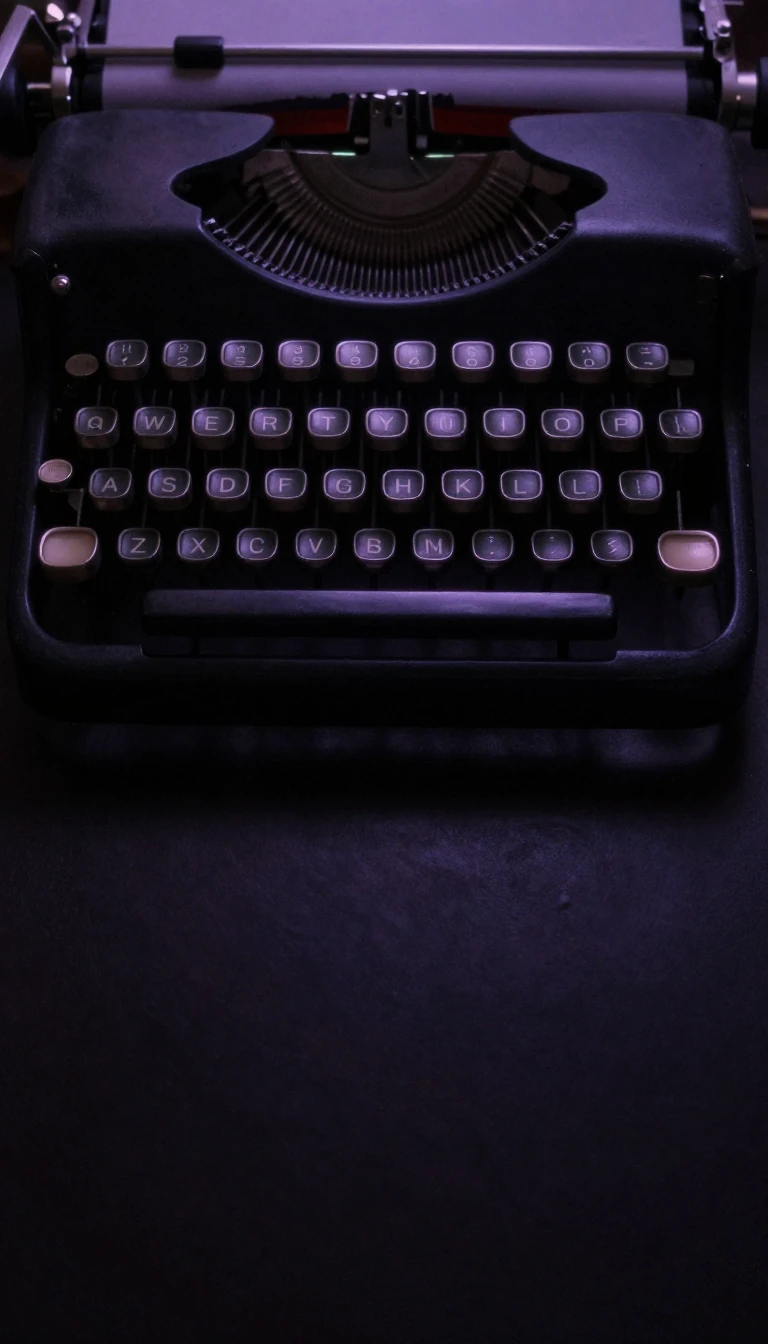
In short: Sans-serif typefaces define our digital age, yet their origins are rooted in 19th-century shock value. Initially dismissed as crude, uncultured, and even monstrous, these letterforms were once plastered across London shops to astonish the public. Today, they are the standard for clarity, modernity, and the screens we stare at daily.
The term 'sans-serif'—meaning 'without line'—belies a complex history of aesthetic rebellion. In the early 1800s, when printing was dominated by ornate Roman and Didone typefaces, the sudden appearance of bold, monoline letters on London shopfronts caused a stir. Critics, including poet Robert Southey, mocked these 'Egyptian' characters, claiming they lacked proportion and beauty. The label 'grotesque,' which later became a formal classification, was originally a pejorative term derived from the Italian 'grottesco,' implying something cave-like, malformed, or monstrous.
For over a century, traditional printers viewed these designs with deep suspicion. Master printer Daniel Berkeley Updike famously declared in 1922 that sans-serifs had no place in an 'artistically respectable' shop. It was not until the 1920s and 1930s that the style gained legitimacy through the Bauhaus movement and the release of geometric designs like Paul Renner’s Futura. These typefaces were marketed as the 'typeface of our time,' successfully bridging the gap between classical Roman proportions and a spare, modern aesthetic.
The mid-twentieth century brought the International Typographic Style, or Swiss style, which elevated neo-grotesque designs like Helvetica to global dominance. However, this uniformity eventually sparked a counter-reaction. By the 1960s, designers began embracing the 'eccentricities' of older, clunkier grotesque types, finding them more evocative than the polished, neutral alternatives. This tension between the geometric, the humanist, and the grotesque continues to define the genre.
Today, the utility of sans-serifs is undeniable. Their lack of fine, fragile serifs makes them ideal for low-resolution digital displays where traditional details might vanish. From the architectural precision of Gill Sans to the legibility-focused designs of the 1990s like Verdana and Tahoma, the genre has evolved from a shocking street-level novelty into the essential infrastructure of modern communication.
Opens the Intellect+ feed with this card first. Swipe up for the next one.
Sources
- Summary by Intellect · source: Sans-serif
To cite this card, link to https://intellectplus.co.uk/app/society-sans-serif.
How we source, check and correct cards: Editorial standards.
General information, not professional advice. Spotted an error? Flag the card or see corrections and complaints.
Intellect Plus is a visual educational discovery platform for exploring fascinating facts and ideas. Brain Food, Not Brain Rot. What is Intellect Plus?
Related
More in UK & Ireland: life · More in Society · Latest · A–Z · All topics
