Why the small strokes at the end of letters define our reading experience
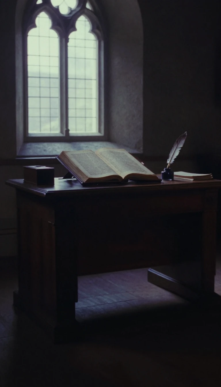
In short: Serifs are the small, decorative strokes attached to the ends of letters, a feature born from ancient stone-carving techniques. While they have defined Western typography for centuries, their necessity in the digital age remains a subject of intense debate, balancing historical readability against the demands of modern screen resolution.
The origin of the serif is widely attributed to Roman inscriptional lettering. Father Edward Catich proposed in 1968 that these strokes were not originally decorative, but rather the result of stone carvers following brush-painted outlines on stone, which naturally flared at the ends. Other theories suggest they were added to neaten the edges of chiseled lines. Regardless of their start, serif typefaces evolved into four major categories: Old-style, Transitional, Didone, and Slab serif. Old-style fonts, dating back to 1465, prioritize organic readability, while the high-contrast Didone styles, emerging in the late 18th century, became iconic for their crisp, elegant appearance in high-end print media.
The debate over whether serifs improve reading comprehension is ongoing. Scientific studies conducted between 1982 and 1990 by Colin Wheildon suggested that sans-serif fonts could impair comprehension in print, leading to the long-standing preference for serifs in books. However, digital displays have complicated this. At low resolutions, where glyphs are rendered in fewer than 20 pixels, serifs can become distorted or disappear, leading many to favor sans-serif designs for web content. Yet, as screen technology advances toward 300+ dpi, these technical limitations may eventually vanish, potentially rendering the screen-specific preference for sans-serif obsolete.
Serif-like features are not exclusive to the Latin alphabet. In East Asian typography, the Song or Ming style—popularized during the Song and Ming dynasties—features horizontal strokes ending in thickened ornaments, a result of wood-block carving constraints where horizontal lines were easier to cut along the grain. These 'fish scales' or 'uroko' serve as the functional equivalent to Western serifs. Whether in the Latin alphabet or Chinese characters, these strokes continue to shape how we perceive text, bridging the gap between ancient calligraphic traditions and the high-resolution screens of the future.
Opens the Intellect+ feed with this card first. Swipe up for the next one.
Sources
- Summary by Intellect · source: Serif
To cite this card, link to https://intellectplus.co.uk/app/culture-serif.
How we source, check and correct cards: Editorial standards.
General information, not professional advice. Spotted an error? Flag the card or see corrections and complaints.
Intellect Plus is a visual educational discovery platform for exploring fascinating facts and ideas. Brain Food, Not Brain Rot. What is Intellect Plus?
Related
More in Languages · More in Cultures · Latest · A–Z · All topics
