The hidden efficiency of the letters we join together
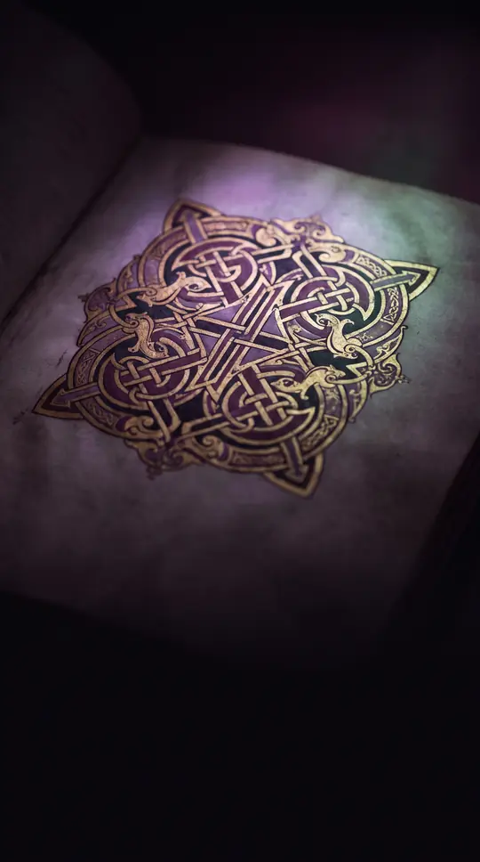
In short: From the ampersand to the Bluetooth logo, ligatures are more than just decorative flourishes. Born from a merchant's need for speed and a scribe's quest for beauty, these joined characters reveal how the practical demands of handwriting have shaped the very visual language of human civilization.
A ligature is the fusion of two or more characters into a single glyph. The term derives from the Latin 'ligare', meaning to bind or tie. While often viewed as an aesthetic choice in modern typography, the origins of ligatures are deeply rooted in utility. In ancient Sumerian cuneiform and Egyptian hierac, character combinations evolved from early ligatures into distinct characters. Later, during the 9th and 10th centuries, medieval monks used them to increase writing speed, while merchants utilized abbreviations and joined letters to streamline record-keeping and transactions.
The mechanics of ligatures vary between handwriting and printing. In calligraphy, ligatures often emerge from the continuous motion of a pen, a style known as cursive. In the blackletter scripts of the Middle Ages, scribes would superimpose the edges of letters, such as 'b', 'o', and 'p', to create a dense, unified texture. In the era of movable type, which began around 1450, ligatures served a technical purpose: they prevented physical collisions between delicate parts of letters, such as the 'tittle' of an 'i' hitting the hood of an 'f'.
The 20th century saw a decline in ligature use due to the rise of sans-serif typefaces and the advent of inexpensive phototypesetting in the 1970s. The digital revolution and the mass production of the IBM Selectric typewriter in 1961 further pushed them toward the margins. However, the 21st century has seen a resurgence. Modern technologies like OpenType and software like Donald Knuth's TeX allow for complex, programmable ligatures. Today, they are used both to evoke classical antiquity in high-end fonts and to facilitate the complex character requirements of modern global languages.
Opens the Intellect+ feed with this card first. Swipe up for the next one.
Sources
- Summary by Intellect · source: Ligature (writing)
- Also: Ligature | calligraphy | Britannica
To cite this card, link to https://intellectplus.co.uk/app/culture-ligature-writing.
How we source, check and correct cards: Editorial standards.
General information, not professional advice. Spotted an error? Flag the card or see corrections and complaints.
Intellect Plus is a visual educational discovery platform for exploring fascinating facts and ideas. Brain Food, Not Brain Rot. What is Intellect Plus?
Related
More in Languages · More in Cultures · Latest · A–Z · All topics
