Why your computer screen still uses the language of 19th-century metal foundries
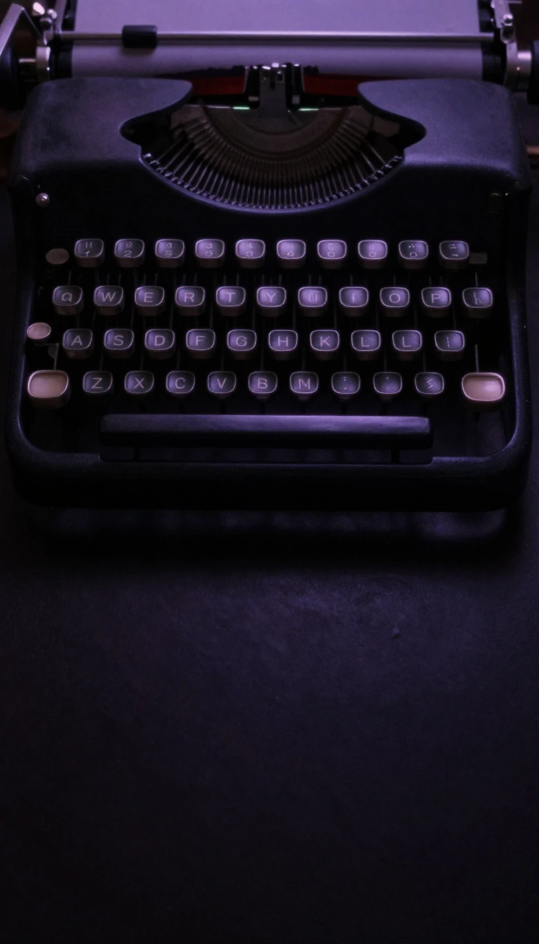
In short: The term font originally described a physical collection of cast-iron characters used in manual printing. While we now use digital files, the terminology remains rooted in the physical constraints of the letterpress era, from the cases holding our letters to the lead strips used to space out lines of text.
In the era of manual printing, a font was a specific physical set of metal or wood type. Each font was defined by its size, weight, and style, and printers purchased them in precise quantities based on language frequency. For instance, a 12-point font might include 14 uppercase 'A's and 34 lowercase 'a's, reflecting the distribution of letters in the language. The term itself derives from the Middle French 'fonte', meaning cast iron, referencing the casting process at a type foundry.
The physical layout of a printing house dictated our modern digital language. We call capital letters 'uppercase' and small letters 'lowercase' because of the physical wooden cases where the metal type was stored; the capital letters were kept in the more distant upper case, while the more frequently used small letters were kept in the closer lower case. Similarly, the term 'leading' for line spacing persists from the soft lead strips used to separate lines of metal type in a printing chase.
Technological shifts in the 1880s and 1890s introduced 'hot lead' typesetting, which allowed type to be cast as it was set, either character by character or in entire lines. Today, however, these physical constraints have vanished. In contemporary computing, font and typeface are often used interchangeably to describe scalable digital files. While digital fonts often use identical letterforms across sizes, designers may still adjust specific elements to ensure readability at extreme scales, bridging the gap between historical craft and modern digital presentation.
Opens the Intellect+ feed with this card first. Swipe up for the next one.
Sources
- Summary by Intellect · source: Font
To cite this card, link to https://intellectplus.co.uk/app/technology-font.
How we source, check and correct cards: Editorial standards.
General information, not professional advice. Spotted an error? Flag the card or see corrections and complaints.
Intellect Plus is a visual educational discovery platform for exploring fascinating facts and ideas. Brain Food, Not Brain Rot. What is Intellect Plus?
Related
More in Media and communication · More in Technology · Latest · A–Z · All topics
