Why your digital fonts are measured by a standard born in the 18th century
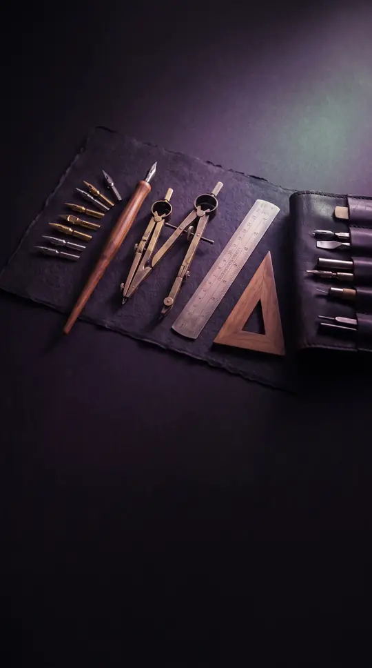
In short: Typography relies on a complex web of historical units that predate modern digital screens. From the French Royal inch to the American Johnson pica, these measurements were designed to solve physical printing problems. Today, we use a simplified version, but the legacy of these old systems remains deeply embedded.
The history of typographic measurement is a story of competing standards and regional adaptations. In the 1780s, François-Ambroise Didot refined a system based on the French Royal inch, building upon the earlier work of Pierre Simon Fournier. This Didot point system became the standard across much of Europe, with 12 points forming a cicero. Because European languages often require extra space for accent marks, these units were physically distinct from the systems that emerged in English-speaking regions.
In the United States and Britain, the path to standardization was more fragmented. By the late 19th century, various foundries used different measurements, leading to significant confusion. The American Point System, officially adopted in 1886, was based on the Johnson pica—a unit derived from the influential Mackellar, Smiths and Jordan foundry. This pica was defined as exactly 0.166 inches, a departure from the simpler mathematical divisions used in other systems. This inconsistency meant that printing equipment, such as Monotype wedges, often had to be marked differently for European and American markets.
The digital age brought a shift toward the current desktop publishing standard, which defines a pica as exactly 1/6 of a modern inch. This effectively restored the original logic of Fournier’s division method, where a base unit is divided into smaller, proportional parts. Alongside these, the 'twip' was introduced for digital displays, representing 1/20 of a point. Despite these modern adaptations, the traditional units persist in specialized contexts, and some regions, like Japan, have explored metric-based alternatives like the 'kyu' to simplify the process further.
Opens the Intellect+ feed with this card first. Swipe up for the next one.
Sources
- Summary by Intellect · source: Typographic unit
To cite this card, link to https://intellectplus.co.uk/app/science-typographic-unit.
How we source, check and correct cards: Editorial standards.
General information, not professional advice. Spotted an error? Flag the card or see corrections and complaints.
Intellect Plus is a visual educational discovery platform for exploring fascinating facts and ideas. Brain Food, Not Brain Rot. What is Intellect Plus?
Related
More in Measurement · More in Science · Latest · A–Z · All topics
