The typeface so sharp it was accused of damaging human eyes
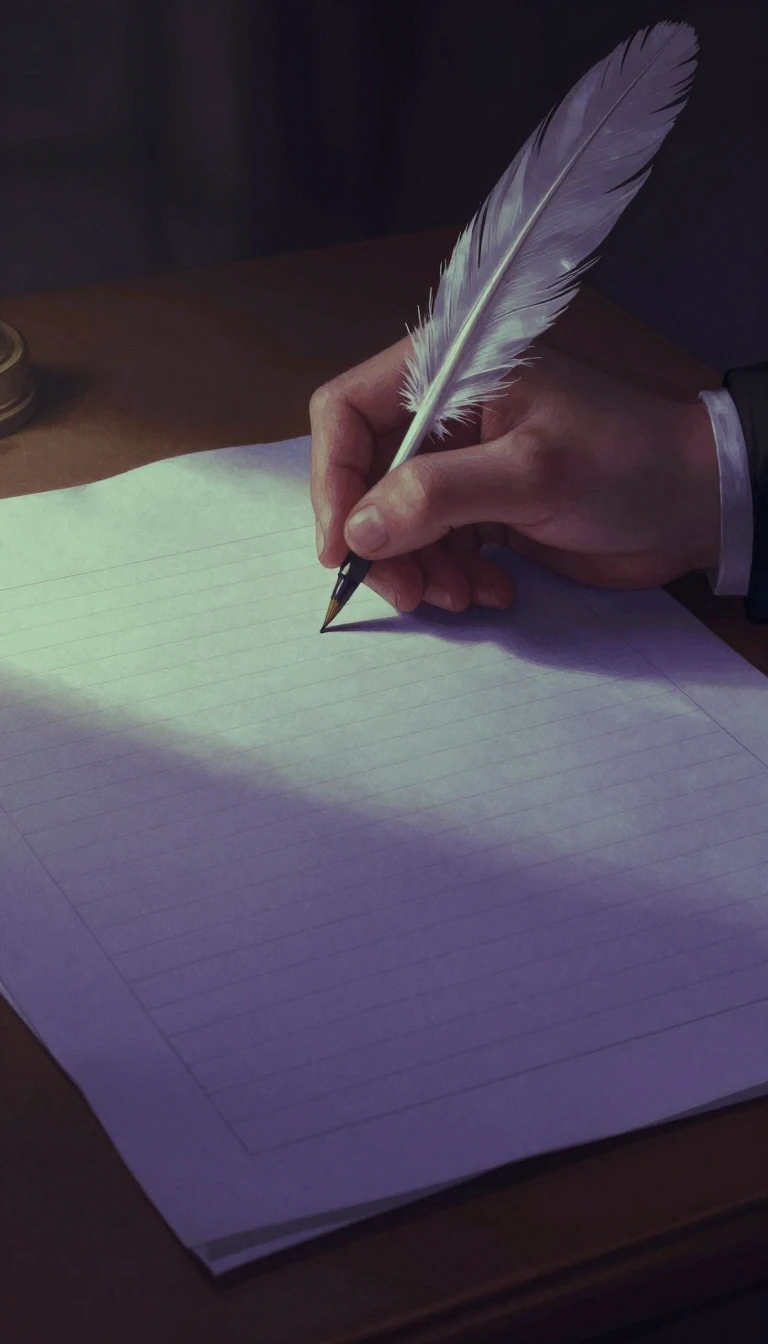
In short: In 1757, John Baskerville didn't just design a font; he engineered a revolution in printing. By pushing the limits of contrast and clarity, he created a 'transitional' style that was so radical his contemporaries claimed it physically hurt to look at it.
Baskerville was a wealthy industrialist who combined his background as a calligraphy teacher with a perfectionist's obsession with manufacturing. At a time when English printing was generally low-quality, he sought to create books of the "greatest possible quality." This involved a holistic technical overhaul: using level presses, high-quality ink, and paper pressed to a glazed, gleaming finish. His typeface reflected this pursuit of perfection, featuring sharper serifs, more circular curves, and a vertical axis for rounded letters—a significant departure from the conservative designs of his era.
The aesthetic shift was so stark that it provoked genuine controversy. Critics claimed the high contrast between thick and thin strokes damaged the eyes. This friction highlights Baskerville's role as a transitional figure; he moved typography away from old-style faces toward the more extreme 'Didone' styles of the 19th century. While his work was admired by figures like Benjamin Franklin, it remained somewhat unpopular in Britain initially because it was so specialized and elite.
The legacy of Baskerville is a complex web of revivals and regional variations. Because his original materials were sold to a French publisher after his death, British foundries like Fry produced their own versions, such as 'Baskerville Old Face.' These variants often differ in subtle ways, such as the shape of the letter 'a' or the inclusion of bold weights that didn't exist in 1757. Today, while it remains a staple of book design and government identities, it serves as a masterclass in how technical innovation can fundamentally alter human perception.
Historically, Baskerville’s influence was more localized than some patriotic scholars suggest; there is little evidence of a 'Baskerville school' on the continent. However, his commitment to the 'ideal letterform'—evidenced by stone-carving samples dating back to 1730—established a standard for elegance and symmetry that continues to define premium typography today.
Opens the Intellect+ feed with this card first. Swipe up for the next one.
Sources
- Summary by Intellect · source: Baskerville
To cite this card, link to https://intellectplus.co.uk/app/culture-baskerville.
How we source, check and correct cards: Editorial standards.
General information, not professional advice. Spotted an error? Flag the card or see corrections and complaints.
Intellect Plus is a visual educational discovery platform for exploring fascinating facts and ideas. Brain Food, Not Brain Rot. What is Intellect Plus?
Related
More in Languages · More in Cultures · Latest · A–Z · All topics
