Why pastel colors are more than just a soft aesthetic for your home
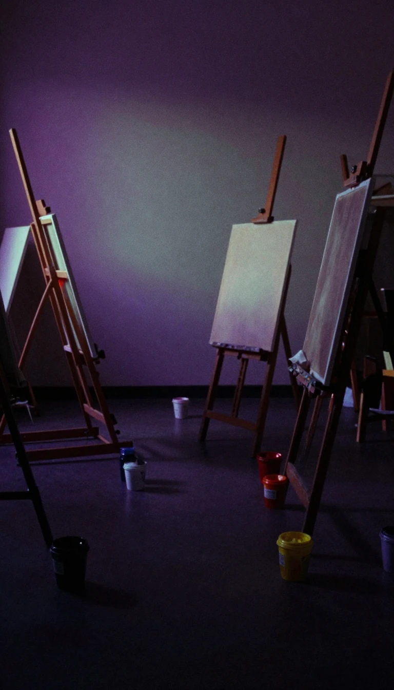
In short: Pastel colors are defined by high value and low saturation, creating a visual experience of calm and nostalgia. Beyond their soothing reputation, these hues have shaped design history from the 1920s to the 1980s. Discover the science and cultural evolution behind this versatile family of colors.
In the HSV color space, pastels are characterized by high value and low to medium saturation. Their name originates from the artistic medium of the same name, which consists of pigment and binding agents. Historically, these sticks produced lower saturation than paints using the same pigments, establishing the defining aesthetic of the color family. While no official registry of hex codes exists, these colors are easily identified through color charts and digital references.
The psychological impact of pastels is rooted in associations with relaxation, harmony, and gentleness. Because they contrast with the bolder, brighter colors common in modern environments, they are frequently employed in interior design to foster focus in classrooms or reduce anxiety in healthcare settings. This ability to soothe makes them a staple for creating environments that feel both simple and nostalgic.
Culturally, pastels have cycled through periods of intense popularity. They were central to the Art Deco movement of the 1920s and 1930s, followed by the retro elegance of the 1940s and 1950s. By the 1980s, they shifted into men's fashion, where pastel suits became symbols of confidence and coolness. Today, their utility has expanded further due to their versatility; they pair effectively with neutrals like black and white, create monochromatic looks when combined with other pastels, and complement a wide range of skin tones.
Despite shifting trends, the core appeal of pastels remains their ability to remain pleasing to the eye and mind. Whether used to provide a soft backdrop or to make a bold fashion statement, their enduring relevance lies in their unique capacity to balance visual interest with a sense of accessibility and calm. They remain a fundamental tool for designers seeking to temper the intensity of the contemporary world.
Opens the Intellect+ feed with this card first. Swipe up for the next one.
Sources
- Summary by Intellect · source: Pastel (color)
To cite this card, link to https://intellectplus.co.uk/app/science-pastel-color.
How we source, check and correct cards: Editorial standards.
General information, not professional advice. Spotted an error? Flag the card or see corrections and complaints.
Intellect Plus is a visual educational discovery platform for exploring fascinating facts and ideas. Brain Food, Not Brain Rot. What is Intellect Plus?
Related
More in Color · More in Science · Latest · A–Z · All topics
